Design Log : Asora v03 Year in Recap
- Jul 29, 2025
- 10 min read
Updated: Jul 31, 2025
Thank you to everyone who picked up Asora. It truly means so much to me to see people buy and enjoy Asora.
I've spent nearly 3 years on this entire journey and more. Which was all leading up to this. I want to thank my siblings for believing in me and supporting me through all of it, without them Asora would not exist.
I wanted to talk about Asora now that we've released it and people have likely gotten a lot of time with Asora. You know what time it is, grab your coffee and enjoy a long read.
(TLDR : Asora 03 is the final version [for now] I think it's exactly what I envisioned and wanted out of my design. There will be a pre-order starting soon for Pink Asora's so be on the lookout for that.)

ASORA DROP
I was emotional during the drop and don't think that will ever change. I saw so many Asora's sold and many people picking up more than one. Thank you.

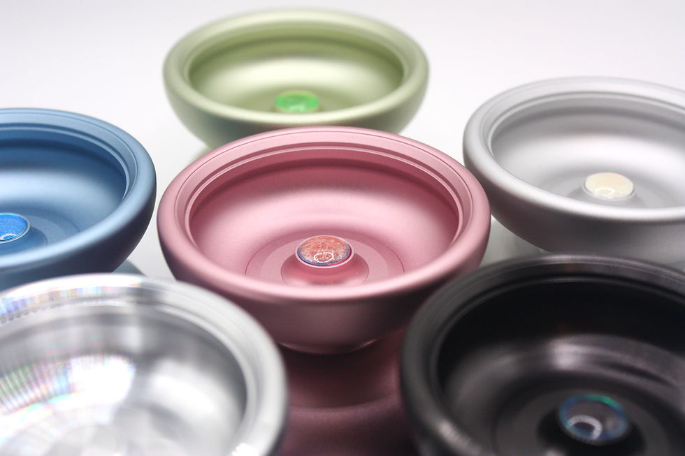
I recognize that I made a big blunder when ordering Asora. I likely should have bought more pink. I only recognized it after seeing it sell out so quick. I've kicked myself over and over for this mistake but I'm still happy with the colors and choices we have available.
I want to express my gratitude to those who weren't able to get pink as their color choice but still picked one up.
I know that I designed Asora to be pink, but I suppose I just didn't recognize how good of a job I did at really defining Asora as a "pink" yoyo. This was planned from the beginning but I also wanted to give people an option to choose from if they didn't want to rock pink. The mistake is on my end by not over compensating and buying more pink than the other colors. In the future, this will definitely not happen again. Though, I am really happy with the colors I picked, I think they all came out really nice.

I'd like to make sure that everyone knows, Pink will return and be back in stock at some point. I truly felt so terrible about not having enough for everyone and hope you can forgive me for this oversight. The other colors are likely a one and done, I have more plans for different colors or finishes in the future.

Lastly, before we get to my review of 03 I want to thank @yoyostore.es on instagram/twitter (Yuta) who has helped me immensely. It was always a goal of mine to be able to sell direct to Japan. So, when Yuta messaged me I was so grateful and excited to be able to share Asora with the Japanese community. To me, it just felt right and I followed my gut instinct. I sent some Asora to Yuta and they sold out! He ordered a few more and those sold out as well! Because of this I feel so blessed and grateful for everything Yuta has done for us. He has been so supportive of dreamcraft and 03's launch would not have gone so well without his help. I'm so grateful for him and his support.
ASORA v03 - REVIEW
You probably know I usually hold back my opinions then give a rating. I like to wait til people form their own opinions before I say anything. I think it's tough to truly relay our thoughts because words like "floaty" or "brick feeling" can mean different things to different people. I'm trying to avoid saying this or that, the graph on the back of the card is merely just aesthetic and fun to me. I don't want people to fully adhere to what I put down, if anything I think Asora has more Power than what I put down.

(If you want more info on the design refer to the previous posts, this is mainly just my rating of Asora, ranting, and giving myself a pat on the back.)

TLDR to this is post; Asora 03 is perfect to me - It's probably a biased opinion, but I think its a 9.8/10. I feel like I try my best to be transparent and unbiased, so hear me out.
I really felt like 01/02 were closer to an 8.5~ or so. I hardly ever, if ever, have given a 10/10 score to any yoyo I've played. There's always things that I would want to change or add and I think that's why Asora exists, because nothing else like it exists. I still felt like 01 and 02 weren't "right" even though they were close, so even there, I needed to change some things. 03 nailed it, it's perfect and there's really no way for me to improve it. A reminder that this rating is given based on my initial goals and how close I reached those goals. So it's not really about it's performance or something, others might think it plays like a 5 and that's okay.
I will likely not be updating the design unless there's a definitive need. Asora is complete and it's been a huge weight lifted off my shoulders. It made these 3 years of designing and 5 different versions of it worth it.

I don't think there's anything better in the same form factor. I truly think that 03 is borderline perfection and that there's no way for me to improve its design based on my original goals.
I've basically hit every goal or target I wanted with it. If you read my previous posts from years ago, you'll understand what my goals were, and if you play all of these versions one after another, you can see exactly where my head was at and what I wanted to change with each rendition. Refining and tweaking every time til it was absolutely perfect. I took my time, I slow cooked this one to perfection and it's full of love; now, I'm sure you'll feel it.

The way it feels, the way it looks, plays, performance, color, packaging, it was all extremely close to the vision that I've been chasing after. Honestly, if I had more resources then It would have been a lot better or closer to my vision outside of the design itself, like the packaging. I'm doing my best to work within what I have and don't want to let "resources" hold me back. So a lot of it was made with arts and crafts in mind, it's not professional, but it's my own way of bringing my vision to life.
Ideally, I would want professionally printed cards, nicer packaging, caps or some sort of rings included, and some string. I wanted to do a lot more but I guess that just lets you know I'm going to keep improving. For now, I was really happy with what I made and knowing that I gave it my best.

I think that's part of the bias to my 9.8/10 rating though. For me, that rating represents the fact that I had a vision of what I wanted this yoyo to feel, play, and look like, and I achieved that vision.
I know you've all felt it before, the ability to "feel" and "play" or "imagine" a yoyo that doesn't exist. Or even one that does, you can remember how heavy it felt on the string, how much performance it had, etc. Sometimes your vision of it becomes blurry and you may play it again, only to find out you remembered it differently. Those yoyos that don't exist that blend between the realm of reality and dreams are what Asora is made of.
I had a very clear and distinct vision of what Asora needed to play like and 03 fully represents that vision.
I think that there's definitely something that attracts me to the shape of Asora and other organic designs like it. I like caps and the idea of being able to modulate your weight at any given moment. I just hated the difficulty of removing caps from FH1's or the insecurity of other designs like the Free-Rider or Metal Zero.

Asora's caps are really easy to remove which has given me the ability to always switch up the configuration whenever I feel like it. I always keep rings, caps, and other assortments on me along with side effects. This makes me feel like I have more than one yoyo in a single design.

One of the most difficult parts to designing Asora was balancing this act, this is why it took me a year to test 01/02 and really hone in what I needed to make sure that Asora played good with caps or any other configuration.

I was also hyper sensitive to the fact that I think that a lot of SE yoyos don't play that great with brass or heavier side effects. I think that being forced into ultra-lights because it's the best option is unfortunate. I wanted to somewhat overcompensate for a lot of these concepts but also tweak and balance Asora to be able to utilize all of these setups and feel good in all of those setups.
This way, at any given moment, depending on how you're feeling, you can pop some caps in, get a FH1 style vibe and feel from it. Later take those caps off and play it with some rings and turn it into a literal "bi-metal" with steel rings.

This to me is the hidden beauty of Asora, the fact that any setup could potentially be your favorite, or change up depending on how you're feeling. Asora can always, and will always be able to match your vibes if you have the right parts to set it up to do that.

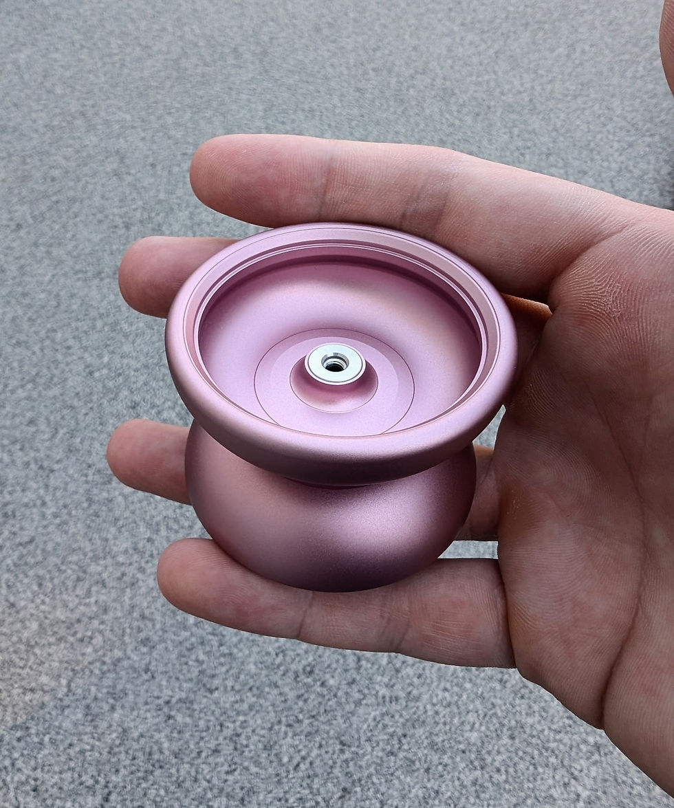
To most people outside of yoyo, my yoyo is no different than the rest. But to me, the profile was so important that I spent years agonizing over how to achieve my ideal profile. How thin was too thin, how big was too big, how small was too small, even by measuring just 1mm more or less, or even just a half could change the entire design. I am extremely picky when it comes to organic shapes and specifically wanted Asora to look a certain way. I ended up 3D printing a ton of different models to test the shape. Making sure the shape of Asora was correct before I sent it off.
This was so important that 01 and 02 didn't have a schmoove ring design because I didn't like the way it broke up the round profile of the organic shape. I knew it would make Asora play better though, so I 'sacrificed' the aesthetics for that improvement after testing 01 and 02.

In the end I'm glad that I went with a Schmoove Ring design with 03 because It would've still left me feeling like I needed a bit more had I not implemented it.
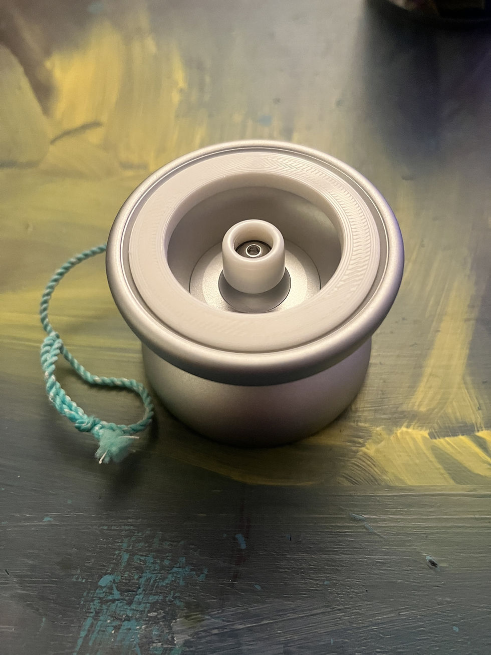
I also widened that catch zone area to help with more complex mounts or adding a bit of help to landing tricks. I have a feeling that in the future, people will use thicker strings and push the gaps wider.
I was trying to "future proof" Asora for modern yoyo play. Hoping that in 10 years Asora can still hang. Seeing that we're 1 year into 03 and people are still playing it, and other's have been able to zontal it makes me feel like it'll be just fine.
I said in a previous post that I wanted Asora 02 to have more power and that it was ever so slightly too restrictive. Part of that was also that 01 and 02 suffered from not playing well with heavy brass SE's. It was like magical work, but I tweaked the design to the best of my abilities with my limited knowledge to best guess where I needed to redistribute the weight to achieve my goal. This gave it the power I wanted but I made sure to distribute the weight so that it didn't alter the feel too much. This was a major balancing act, and in the end I was actually able to shave off a bit of weight while also increasing it's overall performance. Yo-yo design is so interesting to me.
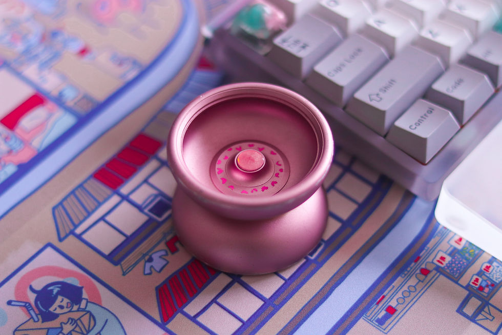
On the outside it appears nice, bubbly, organic, slim, and old school. However, once you pick it up and play it might make you look twice. I suppose deceptive is a good word for the design.

I could never really understand why the organic designs were always lacking performance. I felt like, no matter how clean I played, the yoyo itself didn't have enough spin time for what I wanted out of it. It felt so good to play, but at the same time, it felt like it was holding me back and I would swap to throws with more power.
In my head I felt like Asora could achieve the power and performance I wanted but also feel good to play just like any other organic. That addictive, light, fun, zippy play. I wanted my to have my cake and eat it too. To me, 03 gives the right amount of performance, it won't hold you back unless you play sloppy which is kind of the goal here.
It's a balancing act between you and the yoyo, a conversation. The yoyo will tell you when you're not clean and it'll reward you for clean play - though, far more forgiving than 01 and 02, I think that aides in the "future" proof. Asora isn't designed to be "optimal" but I wanted to make sure that it was at the top of it's game. As true to organic designs as possible while modernizing it for us in 2025.
03 Performs so good that I actually use it to learn or create tricks now, it has enough power and performance that it can give me enough spin time to explore with it. Often times I would do that with more performant yoyos and then refine on an organic. Now I just use Asora for everything and Sagane for a change in pace.
Now, with 03, it easily clears everything that I was comparing it against and even throws that I had never put it up against previously.
Asora is like that 1999 honda civic that lines up next to you with a turbo monster under the hood. That's Asora's vibe to me, that's the deception I want it to bring.
"huh? it's still spinning?"..
This has been a journey for me, a real wild one full of growth showered in love and support from the yo-yo community. I thank you for everything and will always do my best to bring you the best version of my self and my abilities.

I'm really happy with the design and the overall launch of the yo-yo. It's actually the first time I've sold my art or been proud of something I've made in quite a long time, if ever.
A lot of times, the art I make is just made for me, little things here and there. However I had always wanted to learn art in order to start a brand. I've had this vision for a long time and it took time to build up all the necessary skills along with proper timing to execute it. It was hard for me to accept that my art has value, and through this process I've found that understanding. I've learned that my art does have value and it's worth sharing with the world.

Just one last reminder, I will be starting a pink pre-order soon, so keep your eye out for that.

Thank you, sincerely, Nobotik (Suspense).


Comments